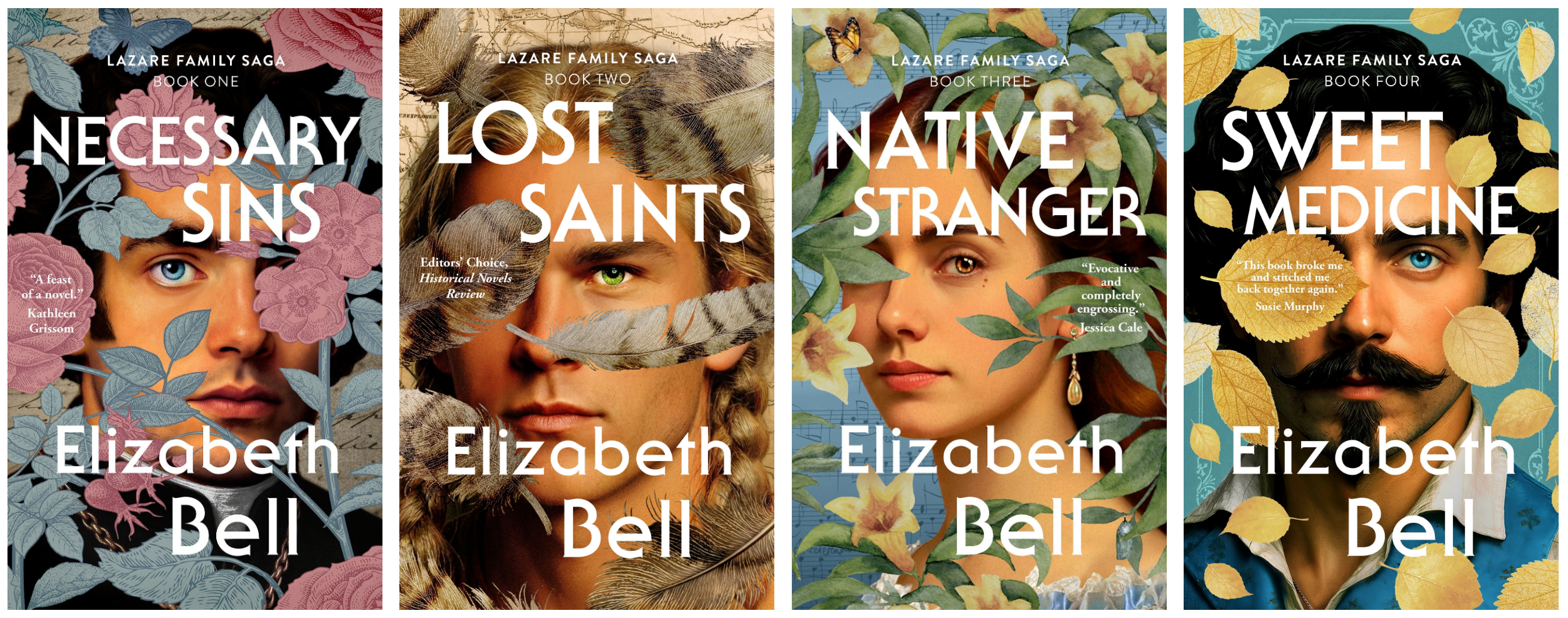
Third Time’s the Charm?
Yes, I have changed the covers of the four books in The Lazare Family Saga…again. (Please be patient while I update all the places where the old covers appear and I have the power to change them, including this website.) Yet another cover refresh was a decision I made not lightly but with great anguish….

The Language of Flowers
Like many a 19th-century novelist, I use the Language of Flowers throughout the Lazare Family Saga as part of my symbolism. I explain some of this floral code in my books, while other references are “Easter eggs.” In this post, I’ll unpack some of those meanings, and I’ll include illustrations in case the word “anemone”…
My Creative Process
I am a “pantser,” not a plotter. This means I write “by the seat of my pants” and do not use an outline. Back in school, when we were supposed to write an outline for an essay, I’d write the essay first, then the outline. I’ve always hated them! For me, structure strangles creativity instead…

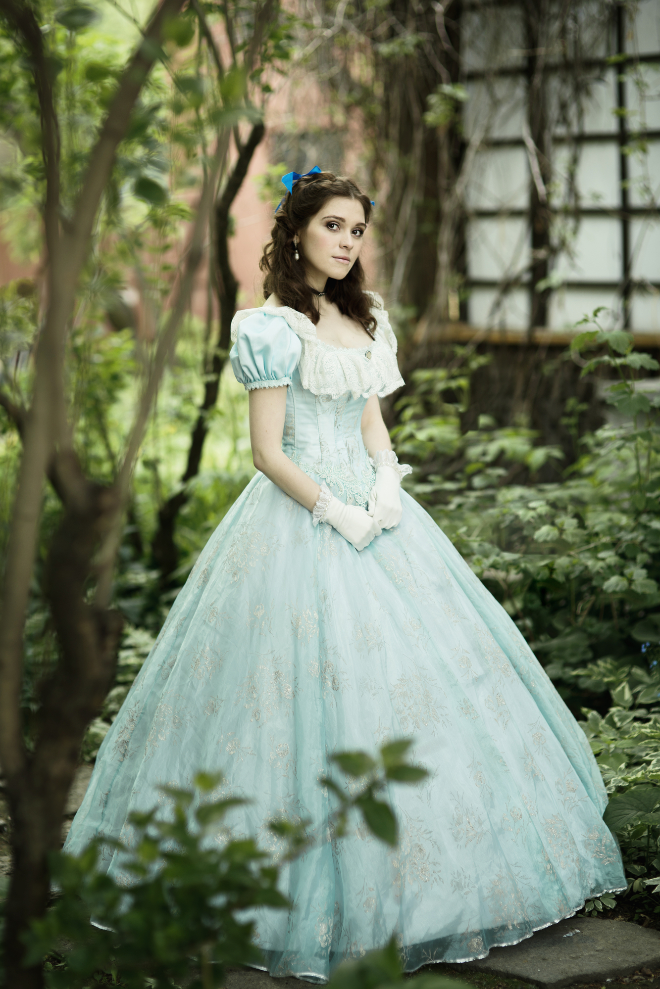
Alternate Opening / Deleted Scene
It took me nearly three decades to write the four-book Lazare Family Saga. Over these years, I wrote at least a dozen opening scenes, set in different places and times in the point-of-view of different characters. Where does this story begin? I kept asking myself and exploring different answers. Here’s an alternate opening scene that…
Flashback: The Year It All Began
Over the next few months, I’ll be reviving some of my most substantial, evergreen newsletters as blog posts so that anyone can read them. And so it begins! The year was 1994. Schindler’s List won the Best Picture Oscar. Jeff Bezos founded Amazon. (Remember the days when it sold only books and you got a free bookmark…

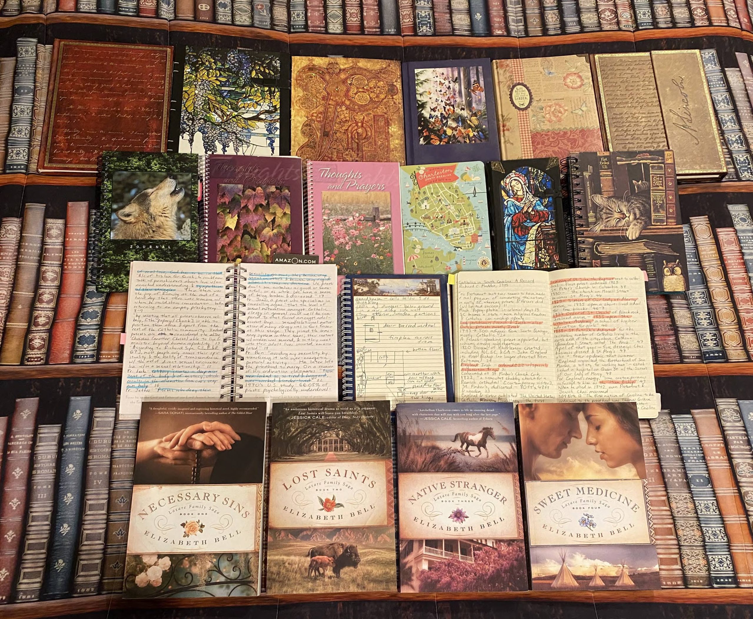
My Debt to Colonial Williamsburg
Most of my Lazare Family Saga series takes place in the 19th century, so you might think visits to an 18th-century living history museum wouldn’t be terribly useful to my research. In fact, Colonial Williamsburg in Virginia was one of the richest sources for my fiction set mostly in 19th-century South Carolina. Here’s how! After I moved…

Anatomy of a Book Cover, Part 2
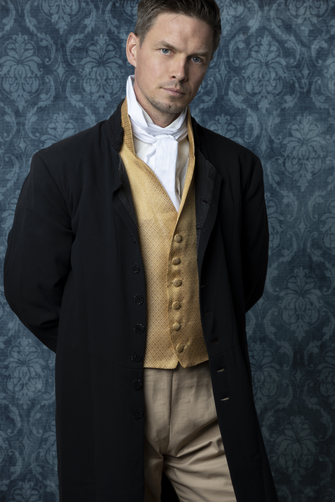
Are you ready for the real designer wizardry? To quote Desdemona in Othello: “O, these men, these men!” The male characters on the ebook covers of Necessary Sins and Sweet Medicine were particularly challenging to represent with stock images. No single image would do; my cover designer, Damonza, had to combine multiple images and make…
Anatomy of a Book Cover, Part 1
After five months of research and revisions, the ebooks of The Lazare Family Saga have brand-new covers at last! If you’re curious why and how they look the way they do, make yourself comfortable. The creation of these four covers for my fictional family saga is a saga itself, so I’ve split it into two…
On Second Thought…
“Ring out the old, ring in the new…” — Alfred, Lord Tennyson, In Memoriam (1850) In November-December 2021, I completed a new edit of the entire Lazare Family Saga. I am a perfectionist; I could honestly go through these long books every year and find things to change. But I shall endeavor to be satisfied…

Necessary Sins Has a New Cover!
Why I changed the cover of my debut novel Necessary Sins and what’s on the horizon
End of content
End of content