For the Love of Critters
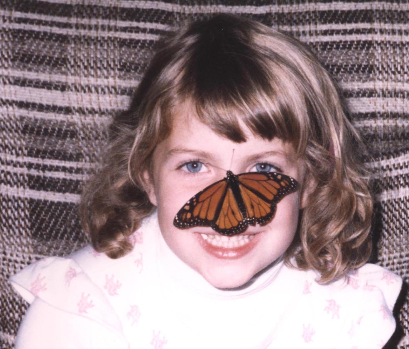
One of my characters, Clare Stratford, is a Southern belle. When she falls in love, however, she considers spending the rest of her life as a Cheyenne Indian. So I knew she couldn’t be prone to “the vapors”; she had to be fearless and in touch with the natural world. Therefore, I gave Clare my…

My Debt to Colonial Williamsburg
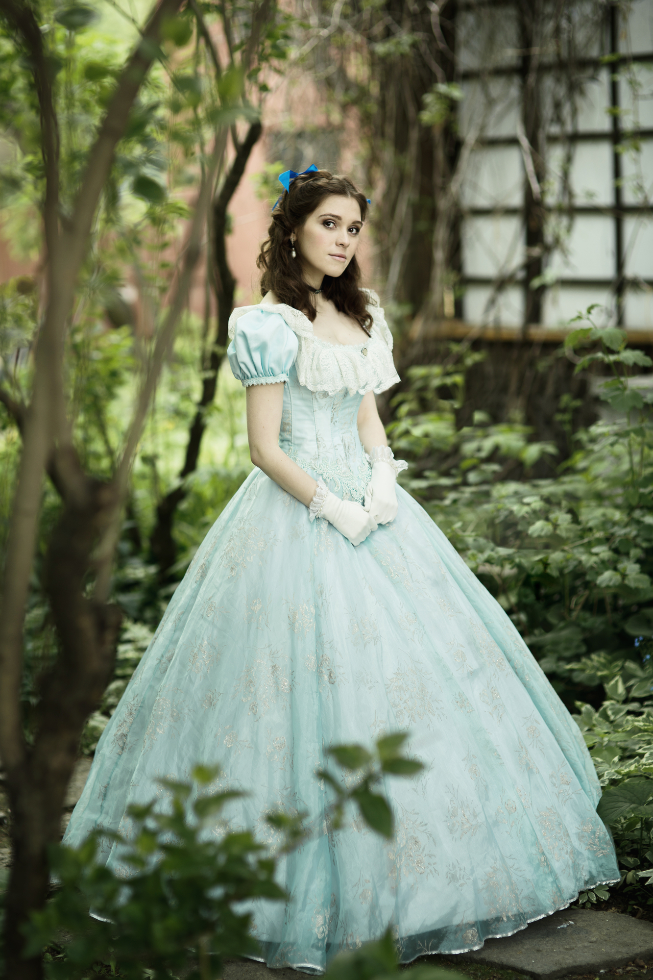
Most of my Lazare Family Saga series takes place in the 19th century, so you might think visits to an 18th-century living history museum wouldn’t be terribly useful to my research. In fact, Colonial Williamsburg in Virginia was one of the richest sources for my fiction set mostly in 19th-century South Carolina. Here’s how! After I moved…

Anatomy of a Book Cover, Part 2
Are you ready for the real designer wizardry? To quote Desdemona in Othello: “O, these men, these men!” The male characters on the ebook covers of Necessary Sins and Sweet Medicine were particularly challenging to represent with stock images. No single image would do; my cover designer, Damonza, had to combine multiple images and make…
Anatomy of a Book Cover, Part 1
After five months of research and revisions, the ebooks of The Lazare Family Saga have brand-new covers at last! If you’re curious why and how they look the way they do, make yourself comfortable. The creation of these four covers for my fictional family saga is a saga itself, so I’ve split it into two…
What’s in a (Character) Name?
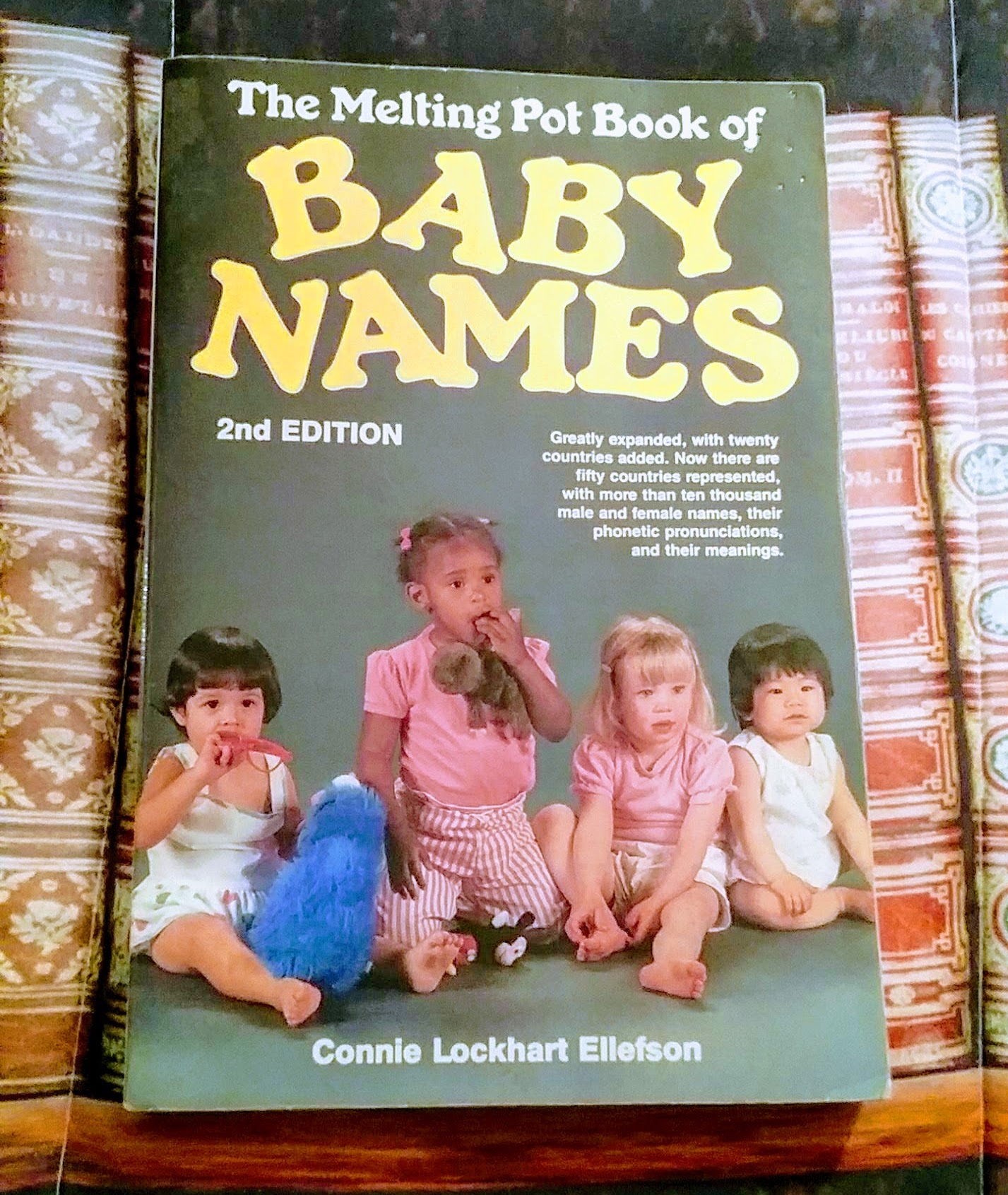
In Romeo and Juliet, William Shakespeare famously wrote: What’s in a name? that which we call a roseBy any other name would smell as sweet;So Romeo would, were he not Romeo call’d,Retain that dear perfection which he owesWithout that title. But he gave those words to a lovestruck teenager. I suspect Shakespeare himself felt differently,…
End of content
End of content