
Necessary Sins Has a New Cover!
Being an independent author means a constant, steep learning curve. Most recently, what’s literally kept me up at night is the realization that my beautiful book covers are nevertheless preventing The Lazare Family Saga from reaching readers. In the 21st century, books—especially indie books like mine—are competing in a crowded digital marketplace. A book brand-new to a reader browsing Amazon or Facebook has literally two seconds to communicate “You would like me!” before that reader scrolls past, never to think of it again. Book covers communicate “You would like me” by reminding readers of the books they love and by communicating genre. Beautiful as they may be, my current covers aren’t doing either of those essentials well.
I thought I understood good cover design. I planned my covers for years as I was writing. I even based my cover concept on other historical novels I’d seen. But those covers came from traditional publishers with marketing budgets and/or authors who were already established. I’m trying to reach people who’ve never heard of me, so my covers have to work harder.
I didn’t fully appreciate The Two-Second Rule or the importance of a cover looking good at thumbnail size. In a digital environment, a book isn’t a physical object to be leisurely admired but a tiny postage stamp that needs to work at a glance. My current covers from Bookfly Design are beautiful and they illustrate my books well. Between picture research and fine-tuning, these covers represent years of painstaking labor by both my designer and myself. I love them, they’re works of art, and I’ve got them hanging on my wall.
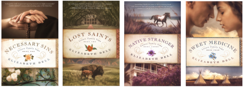
Alas, I’ve learned the hard way that a beautiful work of art does not necessarily make a good book cover. At thumbnail size, these covers aren’t doing their jobs of attracting new readers. There are too many focal points: top image, decorative title plate, and bottom image. People don’t know where to look, so they look away. To quote a marketing adage: “The confused mind says ‘No.'” The first cover, the most important one, is also communicating the wrong things. It’s not saying “antebellum American South” or even “historical fiction” clearly, and many people are mistaking it for genres it’s not.
If you’ve read Necessary Sins, you know why I suggested to my designer that we feature the hands of my priest protagonist, Joseph Lazare. When he’s ordained, his hands are anointed; and when Joseph and his soulmate Tessa touch hands in the book, the moments are erotically charged. But that eroticism is apparent in the cover only if you’ve already read Necessary Sins. To people brand-new to my work, those tender joined hands apparently indicate “This is sweet and clean Christian fiction”—in other words: “There is no on-the-page sex and this book will confirm your faith.” Which is not at all what Necessary Sins is about!
Therefore, in the short term, I worked with my current designer to revise the cover of Necessary Sins so that it more clearly communicates “forbidden love in the antebellum American South involving a Catholic priest.” I was happy to find stock images we could use for both Joseph and Tessa. These images were just uploaded to stock sites in 2020, so they weren’t available when we were designing the first Necessary Sins cover back in 2019.
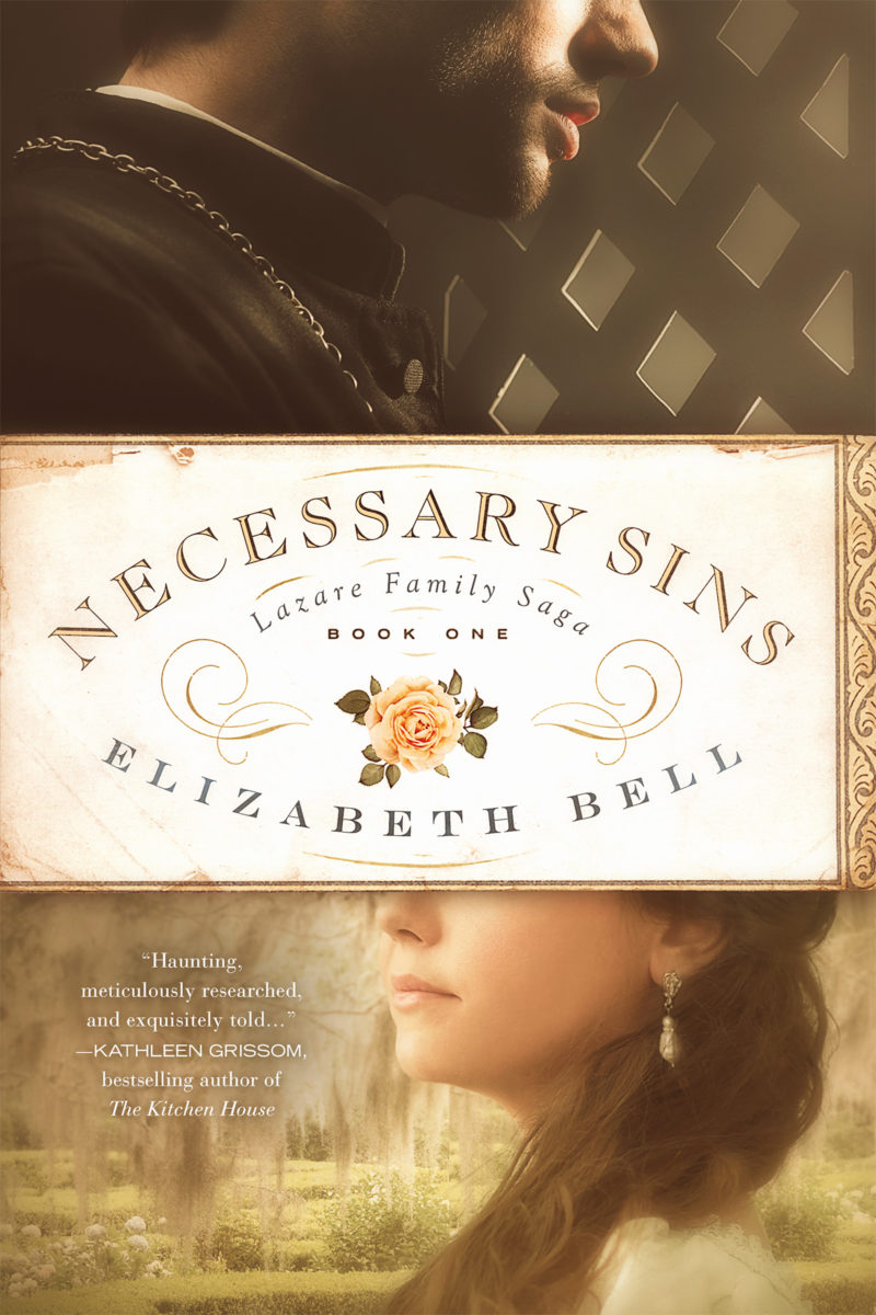
Can you make out the Spanish moss and the parterre garden behind the woman, typical of my Charleston, SC setting? They aren’t as clear as I’d like, but that’s a saga in and of itself. The woman’s barely-visible attire might also be mistaken for a nightgown. In the original image, she’s fully dressed.
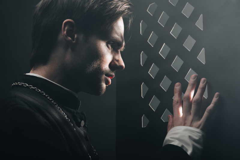
As you may know, chopping off people’s heads is standard practice in historical fiction covers, and it certainly has its advantages. I love the dramatic lighting in the image of this priest in a confessional, but the top half of the model’s head is all wrong for Joseph. The model is a White man with brown hair in a 21st-century style; but if we crop him correctly, he’s more racially ambiguous and can “pass” for Joseph, my black-haired priest who has French and African ancestry and passes as White.
As of this writing, the new cover is live only for the ebook of Necessary Sins. My designer is currently at work on the paperback and hardcover versions. The “hands cover” has become a limited first edition—so if you love it like I do, now would be the time to buy it. 😉
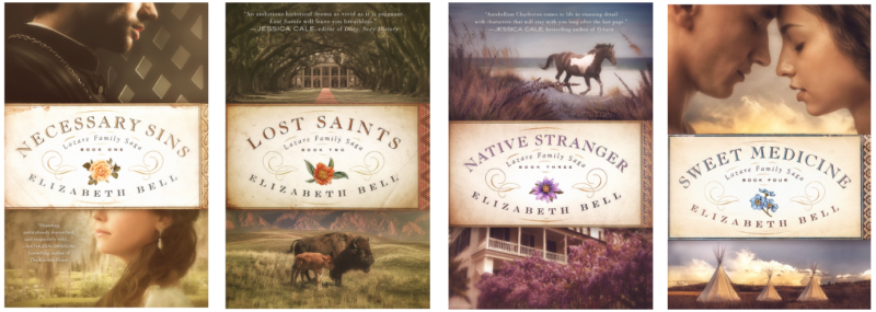
Prefer the ebook? You’re in luck: my shiny new cover and all its contents are on sale for just 99 cents/pence through December 8, 2021. I do like how the man and woman are separated on the new Book One of the series and united on Book Four. It’s great symbolism.
However, this new version of Necessary Sins doesn’t solve the thumbnail problem or pass the Two-Second Test. In order to fix those, after much figurative hair-pulling and literal gnashing of teeth (damn TMD), I have decided to hire a new cover designer to completely redo the whole Lazare Family Saga series. I hope we’ll end up with people on all the covers, and that we’ll be able to include their full faces. After weeks of searching, I’ve found some promising new stock images.
We can’t use the shot of the priest in the confessional with the dramatic lighting, because I’m determined that Joseph will finally have the right skin tone on my upcoming covers. This is impossible with an unedited stock image, because light-skinned Black men in cassocks simply don’t exist on stock sites. But my new designer should be able to do a “head swap” and dress a light-skinned Black model in a cassock, given the right images. Have I found them? Will my designer find them? Will we go in a totally different direction with the new covers?
Only 2022 knows.
Your turn! What do you think of the new Necessary Sins cover? What would you like to see on my redesigned Lazare Family Saga covers? What are some of your favorite historical fiction or family saga covers? Are you an author with a cover revision saga of your own? I’d love to hear from you!
This is gorgeous! It totally makes sense why you changed it (although I loved the previous version too). I’ll need to order a new copy for my brag shelf! 😉
Thank you so much, Jess! I am beyond honored to have a place on your brag shelf with either cover!
Fascinating. I am struggling with mine too because what I have suggests ‘commercial’ (which I’m totally ok with) but frequently eliminates ‘high quality’ (which I like to think I am too!). But cover changing is expensive and many existing readers adore my covers so then I worry about losing their interest! So far I’ve not made the leap but it does keep me thinking…
Your change is a good one, looks very nice and as you say spells the forbidden love out a little more for the two second glance! I hope it does well for you ????
I definitely feel that commercial vs. literary tension too, Melissa. Your work is absolutely high quality! I think as indie authors, we probably shouldn’t be aiming for literary with our covers — we have neither the prestige nor the marketing might of a big publisher to convince people “this is a powerful book you need to read.” I think we probably need to lean towards commercial and have our readers be pleasantly surprised by the quality of our writing. 🙂