Behind My 2026 Covers
What do my new book covers for The Lazare Family Saga mean to me, and how did my designer Damonza and I arrive at them? Let’s dive in! One thing I did differently with my saga’s 3.0 covers was to poll readers for reactions on a site called PickFu.com. This service is far from perfect….
Third Time’s the Charm?
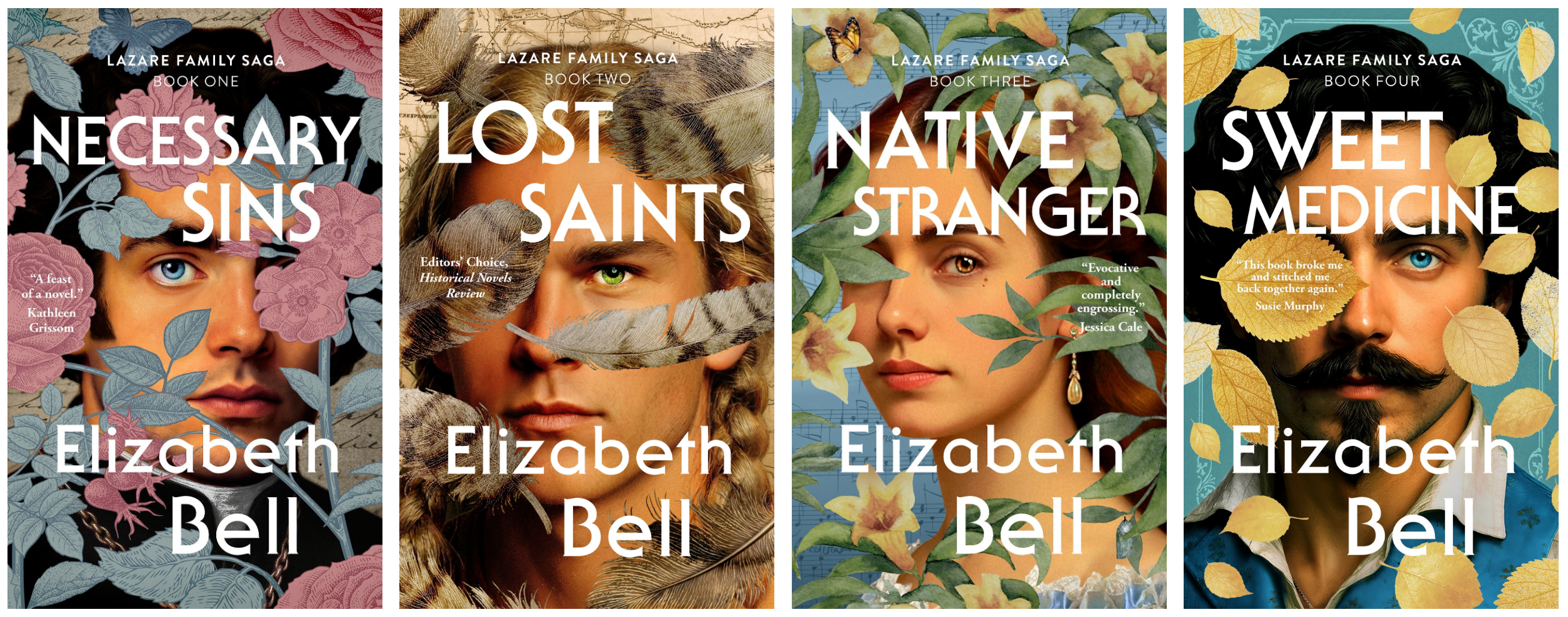
Yes, I have changed the covers of the four books in The Lazare Family Saga…again. (Please be patient while I update all the places where the old covers appear and I have the power to change them, including this website.) Yet another cover refresh was a decision I made not lightly but with great anguish….
The Art Over My Desk
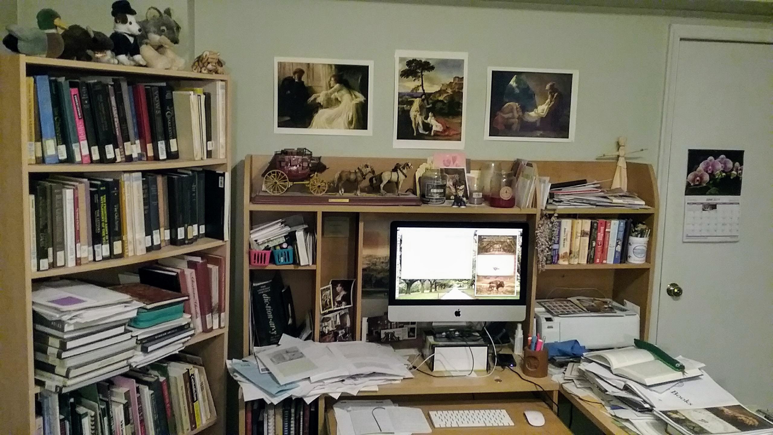
Above my messy writer’s desk overflowing with research materials, I hung three works of art that helped inspire my historical family saga with strong romantic elements. Let’s take a closer look. Frank Dicksee’s The Confession (1896), a Victorian problem picture with multiple possible meanings. Is the man the woman’s husband or her priest? Which one…

Anatomy of a Book Cover, Part 2
Are you ready for the real designer wizardry? To quote Desdemona in Othello: “O, these men, these men!” The male characters on the ebook covers of Necessary Sins and Sweet Medicine were particularly challenging to represent with stock images. No single image would do; my cover designer, Damonza, had to combine multiple images and make…
Anatomy of a Book Cover, Part 1
After five months of research and revisions, the ebooks of The Lazare Family Saga have brand-new covers at last! If you’re curious why and how they look the way they do, make yourself comfortable. The creation of these four covers for my fictional family saga is a saga itself, so I’ve split it into two…

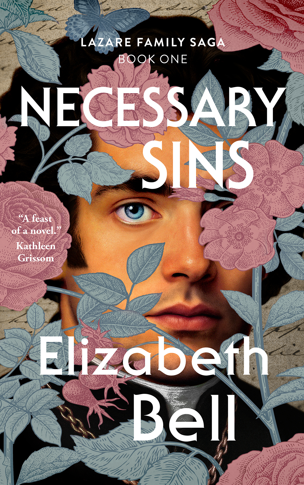
Necessary Sins Has a New Cover!
Why I changed the cover of my debut novel Necessary Sins and what’s on the horizon
What’s Your Genre?
Upmarket. Historical fiction. Family Saga. Mainstream fiction with a central romance. All these terms describe my work, which doesn’t fit neatly into a single category. I see this as a strength. Love beautiful writing tackling profound subjects? You’ll find it in my novels. Love history? I’ll wow you with my research. Love epics about multiple…
End of content
End of content