Anatomy of a Book Cover, Part 1
After five months of research and revisions, the ebooks of The Lazare Family Saga have brand-new covers at last! If you’re curious why and how they look the way they do, make yourself comfortable. The creation of these four covers for my fictional family saga is a saga itself, so I’ve split it into two parts. You might also want to check out this prequel post on why my original covers needed an update for the digital world.
In short, I think of these as my “billboard covers.” Their purpose is to shout “I’m historical fiction set in the 19th century United States! If you like that, check me out!” as potential readers scroll through Facebook, Amazon, and anywhere else they appear online.
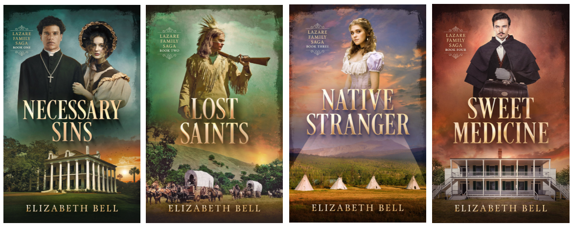
In my cover breakdown, I’ll be speaking from the point-of-view of an indie historical novelist whose books are intended for an adult audience. Also keep in mind that whatever I chose had to be sustainable over a four-book series. The covers have to follow the same “branding”; at a glance, the books must visually belong together.
There are three main routes in book cover design:
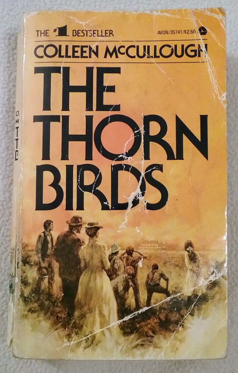
- Hire an illustrator to paint or otherwise create a custom illustration for your book cover. This method was popular in the past and includes the original covers of the books that inspired me to write historical sagas, books such as Colleen McCullough’s The Thorn Birds (1977) and Brock and Bodie Thoene’s Zion Covenant series (1989-1991). Back when I thought I’d be traditionally published, this is what I expected my books to look like.
But times change. Not only is custom illustration prohibitively expensive for an indie author like me (you’re paying not only the illustrator but also a designer to create a book cover using that illustration), such book covers have become rare even in traditional publication, at least for serious historical fiction aimed at adults. Custom illustrations can look cartoonish and give the impression that the book is Young Adult or another genre like fantasy in which illustration remains popular.
2. Hire a photographer who hires models who resemble your characters. The photographer would find costumes appropriate to my book’s time period and do a custom photoshoot, probably incorporating period-appropriate props like jewelry and furniture. They might even take the photos at a historic 19th-century property. All of these elements cost heaps of money, so again, not in my budget for a four-book series.
3. What most indie authors do is choose a talented designer to combine and manipulate existing stock images available on sites like Despositphotos and Shutterstock. Because the first two cover routes weren’t financially feasible, this had to be my choice both for my original covers (now limited to the paperback and hardcover formats, created by Bookfly Design) and for my new covers (ebooks and forthcoming audiobooks, created by Damonza).
Using stock images is easier in some genres than others and easier with some characters than others. Since my fiction is character-driven, I wanted to put people on all the covers this time around. But if some of your characters aren’t White, you have fewer options because there are fewer non-White models on stock sites. In addition, decent images of people wearing historical clothing are few and far between.
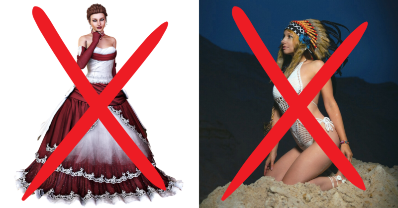
Sure, there are women in “vintage dresses,” but these are usually painfully bad approximations of historical clothing. Since the contents of my books are meticulously researched and accurate, I didn’t want cover models in clothing that is glaringly wrong for my setting—or any historical setting, only a fantasy version of past fashions. Furthermore, these models in “historical” clothing almost always have modern hairstyles and/or makeup, which ruins the effect.
An even worse example of cringe-worthy stock photos are the results for “Native American.” Almost all of these are so atrocious, they are offensive to anyone who knows anything about Native culture. Think naked White women lounging in fields wearing eagle feather headdresses. Shudder.
I should note that an indie author doesn’t have to find stock images before approaching a designer. But designers appreciate it because it saves them time, as long as you give them a few options and don’t insist that Images A and B must appear on the cover even if they don’t work together. The lighting may be incompatible, for example. Moreover, I know 19th-century clothing and American history—not to mention my characters—better than my designer, so I know better which stock images are rubbish and which are close enough.
The problem of finding the right images is exacerbated by the fact that most of the best-for-historical-fiction photographers on stock sites, the ones who have images of models in decent historical clothing, are Russian. English isn’t their first language, so these Russian photographers label their images with generic or misspelled keywords that make the photos hard to find.
For example, the stock image I chose for Tessa on my Necessary Sins ebook cover is titled “A young girl in a hat stands against the background of the forest.” (She’s wearing an 1830s bonnet and gown.) The image we used for Tessa on the paperback and hardcover is “Beautiful woman with long hair in a long white dress. He [sic] sits at the vintage table and looks away.” She is wearing a Regency gown from the early 1800s. It’s truly a mislabelled needle in a haystack situation.
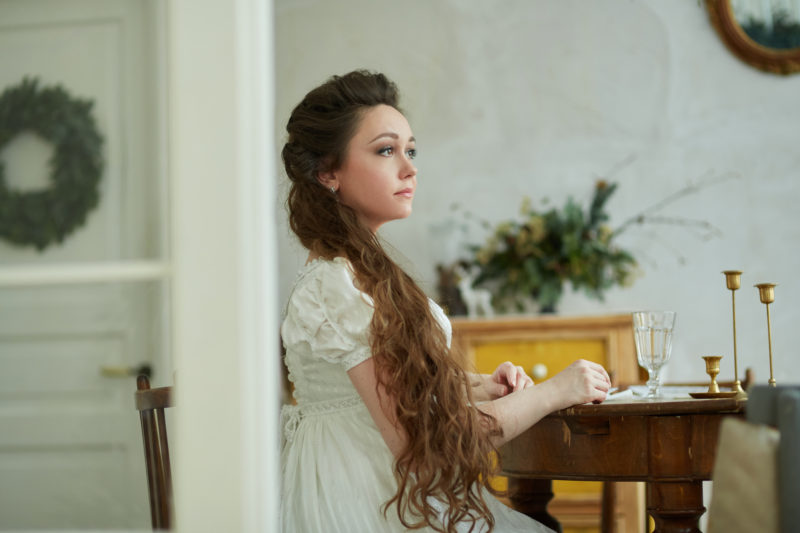
This is why I spent weeks searching stock sites for models who might “play” my characters, using every keyword I could think of. Ninja Tip: I found some photos by clicking on every vaguely decent image of a person in historical clothing that came up in my search, no matter the era, and then viewing the photographer’s other images. This is how I found “Girl in a hat.”
My main goal in redesigning my ebook covers was to say “I’m historical fiction!” at a small size. I knew the best way to do that was to include images of people in historical clothing plus distinctive setting images like an antebellum mansion and covered wagons. Because of branding, before I approached a cover designer with this idea, I had to find usable images of all five of my major characters as well as four good setting images.
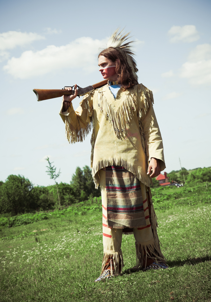
The character who initially worried me most was Ésh, my “White Indian.” He couldn’t be wearing a feather headdress (he’s not a war leader), and he needed to be wearing a shirt (he’s not in a bad romance novel kidnapping a White damsel). As you can imagine, I was over the moon when I found this stock image:
This man isn’t 100% right for Ésh. His hair is too dark (my designer lightened it) and too short, and Ésh’s preferred weapon is a bow and arrow. The decoration on his head is called a “roach,” made of porcupine hair. This kind of headdress wasn’t typically worn by the Cheyenne, but it’s possible when you factor in trade and personal preference. At least it’s not an eagle feather headdress. As stock images go, this man is awesome. And yes, even “Ésh” was taken by a Russian photographer!
This is the image that made representing my central characters on my book covers possible. Since this is the only image of this model that I really liked, this man’s position also dictated that the other characters would be seen from the front. Most of my final character images weren’t uploaded to stock sites till 2020, so they weren’t available when my first designer and I were working on my original covers.
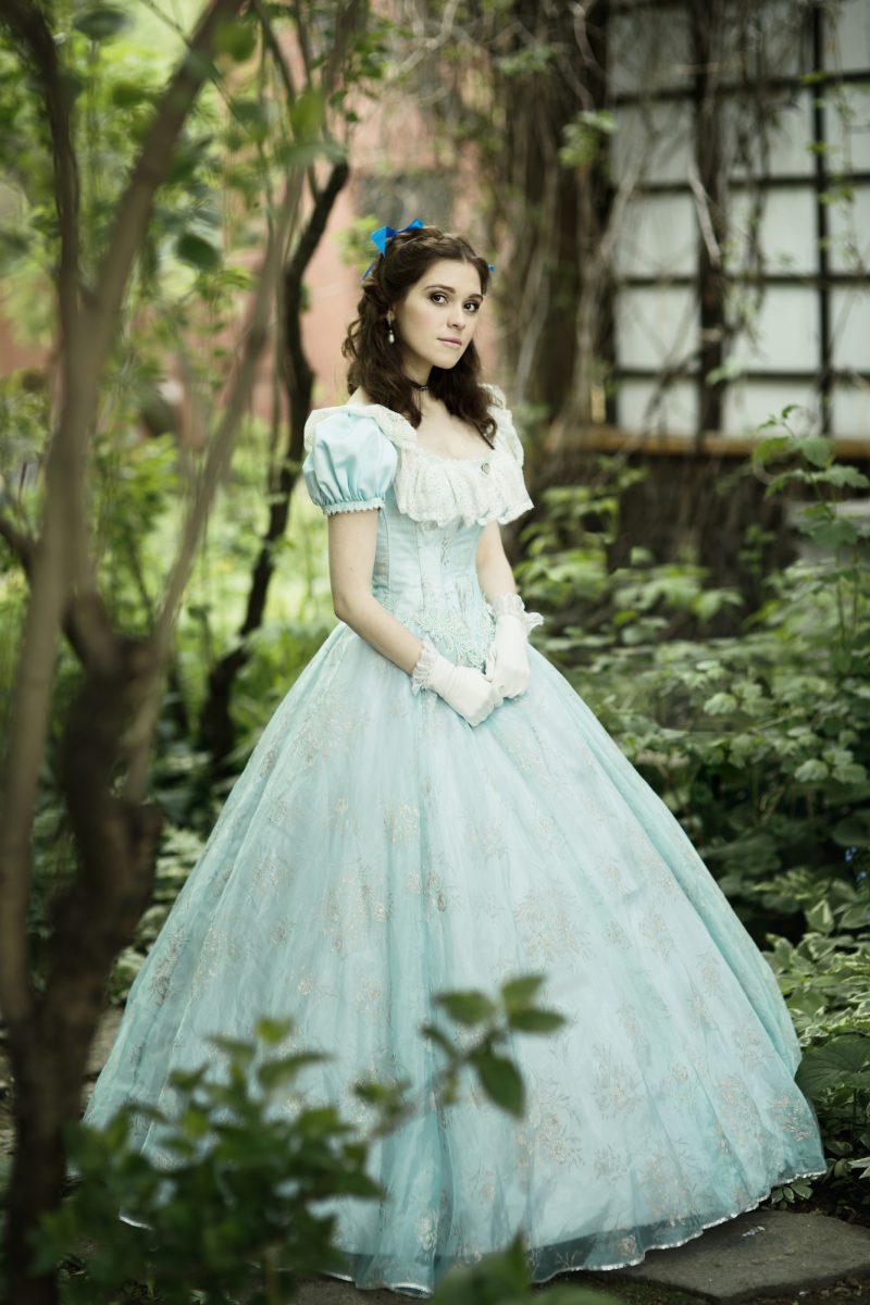
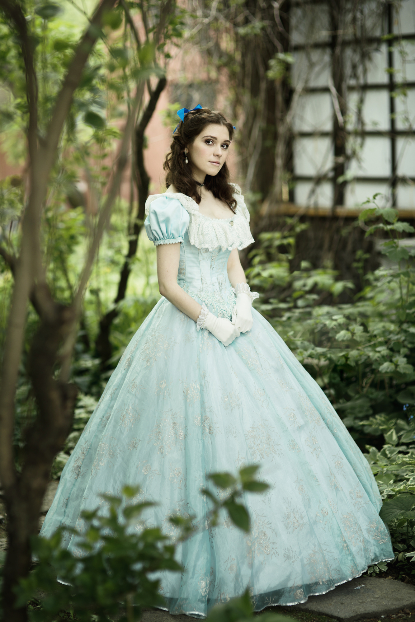
A slightly more useful caption: “Beautiful girl in historical dress, gloves, near the house,” also by Darya Komarova.
My designer lightened the hair of this model for me as well, so she would better resemble my character. Her hair is far too short, and Clare would wear it pinned up, but those aren’t things my designer could fix.
This is another case where only one shot of the model expressed my character; in the other shots of this woman, she looks snooty. Here, she simply looks spunky, perfect for Clare.
On the cover of Native Stranger, I’d hoped to make Clare’s skirt white so that it could better echo the tipis and vice-versa. However, the title had to be legible, and we had to keep a light-colored title for series branding. Therefore, the woman’s skirt had to have some color. My designer went for layering the skirt over the tipi image, which is a cool effect. Here are the final covers:
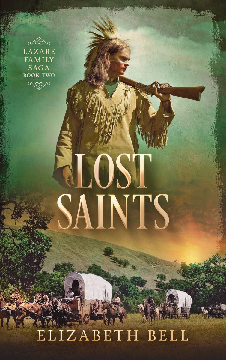
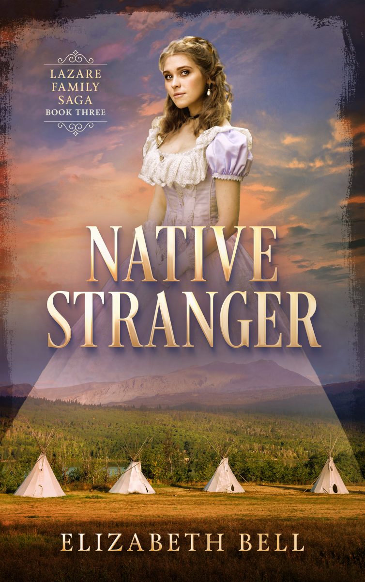
You’d never know it, but originally the stock image of the wagon train and landscape was black and white; my designer colorized it. That’s only the beginning of what a good designer can do. Next week, I’ll take you behind the scenes on the two most complex covers in my new set: Necessary Sins and Sweet Medicine. Psst: Joseph and David were each created from three different stock images!

