Anatomy of a Book Cover, Part 2
Are you ready for the real designer wizardry?
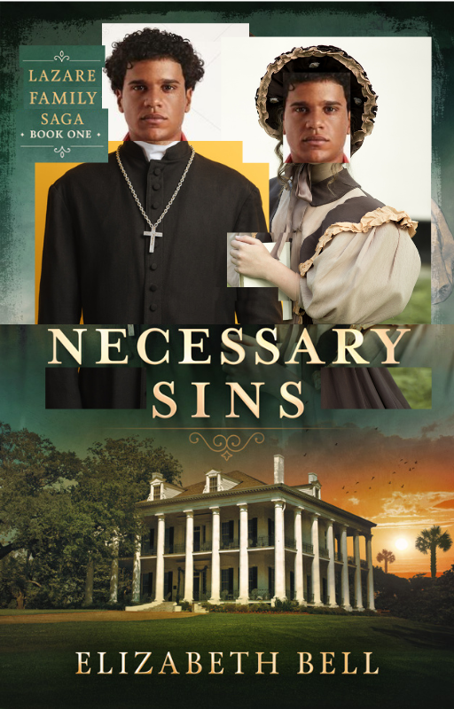
To quote Desdemona in Othello: “O, these men, these men!” The male characters on the ebook covers of Necessary Sins and Sweet Medicine were particularly challenging to represent with stock images. No single image would do; my cover designer, Damonza, had to combine multiple images and make them look like they belonged together.
Joseph Lazare, the protagonist of Necessary Sins, is multiracial: White French, African (Yoruba), and Native American (Dakota). He’s also a Catholic priest, and this is his primary identity. There were no images of appropriate men in cassocks on stock sites. Lots of White men and a few dark-skinned Black men, but none with curly black hair and the right skin tone.
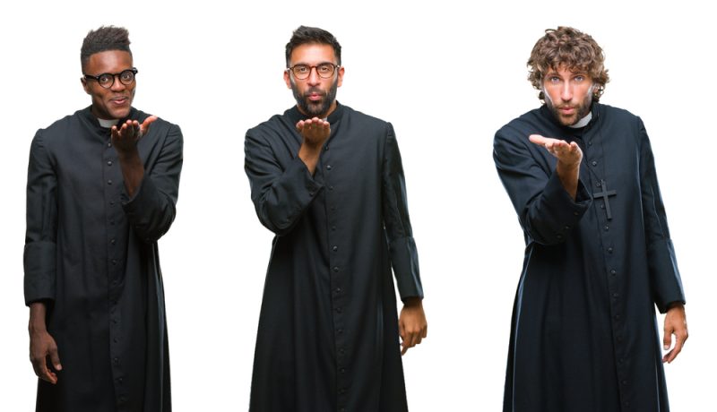
A couple of Latino priests seemed promising, and in fact Joseph’s racist great-grandmother tells Joseph and his father that they’re part Spanish. But the Latino priests didn’t work because they either had a modern hairstyle (cropped too short); they had beards (until modern times, Catholic priests weren’t allowed to grow facial hair); and/or their expressions were simply silly (see above). For serious historical fiction, I needed a serious expression. Their short hairstyles, facial hair, spectacles, and silly or smiling expressions also prevented me from finding any White man who could “play” Joseph, whatever he was wearing.
In addition, most cassocks (a.k.a. soutanes) on stock sites weren’t appropriate for the early 19th century. The buttons couldn’t be plastic, and the priestly collar couldn’t be the starched modern kind (see above). I found an acceptable cassock at last, even if the man wearing it was White. Fortunately, given the right two images, my designer was able to do a “head swap,” combining the head of an appropriate Black man with an appropriate cassock like a digital paper doll.
Let me show you the original stock images I suggested to my designer for Necessary Sins and then the final design. (My designer sourced them from Shutterstock. I’ve purchased the same images from Depositphotos, which is more reasonably priced for small-scale users like me.) First, Joseph’s head:

You’ll notice that I had my designer lighten this man’s skin. Considering the history of Black people chemically lightening their skin to fit in with White culture, this bothers me. But as I indicated above, I just couldn’t find a White or racially ambiguous man who was right for Joseph; their expressions, hairstyles, and/or beards were always wrong. This man’s curly black hair is perfect for Joseph. (My designer filled in the top of his head from another shot of the same model.) I also like the way his full hair echoes the shape of Tessa’s bonnet and vice-versa. His features are really “too African” to pass for White as Joseph does, but using a Black model felt more truthful than using a White man with modern hair. Like all of my female cover models, this model (or at least the photographer) is Russian too!
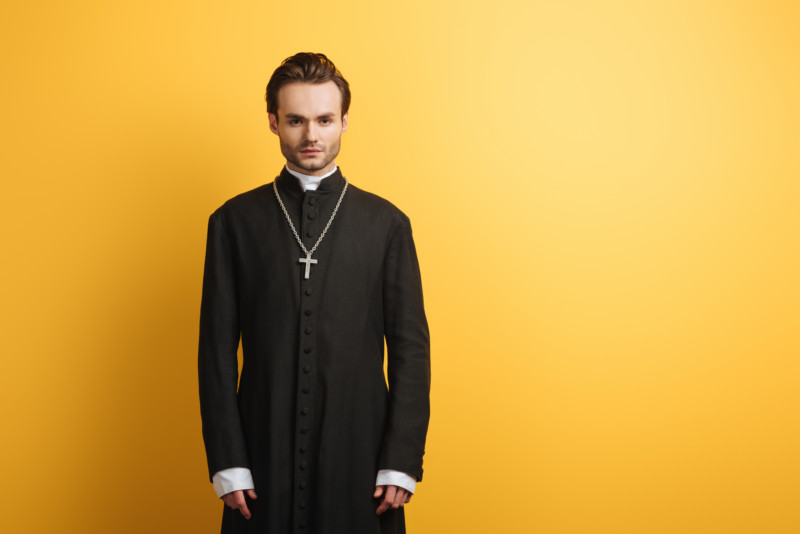
Joseph’s body, the same model who appears on the paperback and hardback covers of Necessary Sins, there with dramatic lighting inside a confessional. Note the cloth cassock buttons and soft collar. While this photo wasn’t taken in Russia, it was taken in Ukraine. (I dearly hope that both the model and the photographer are safe right now.)
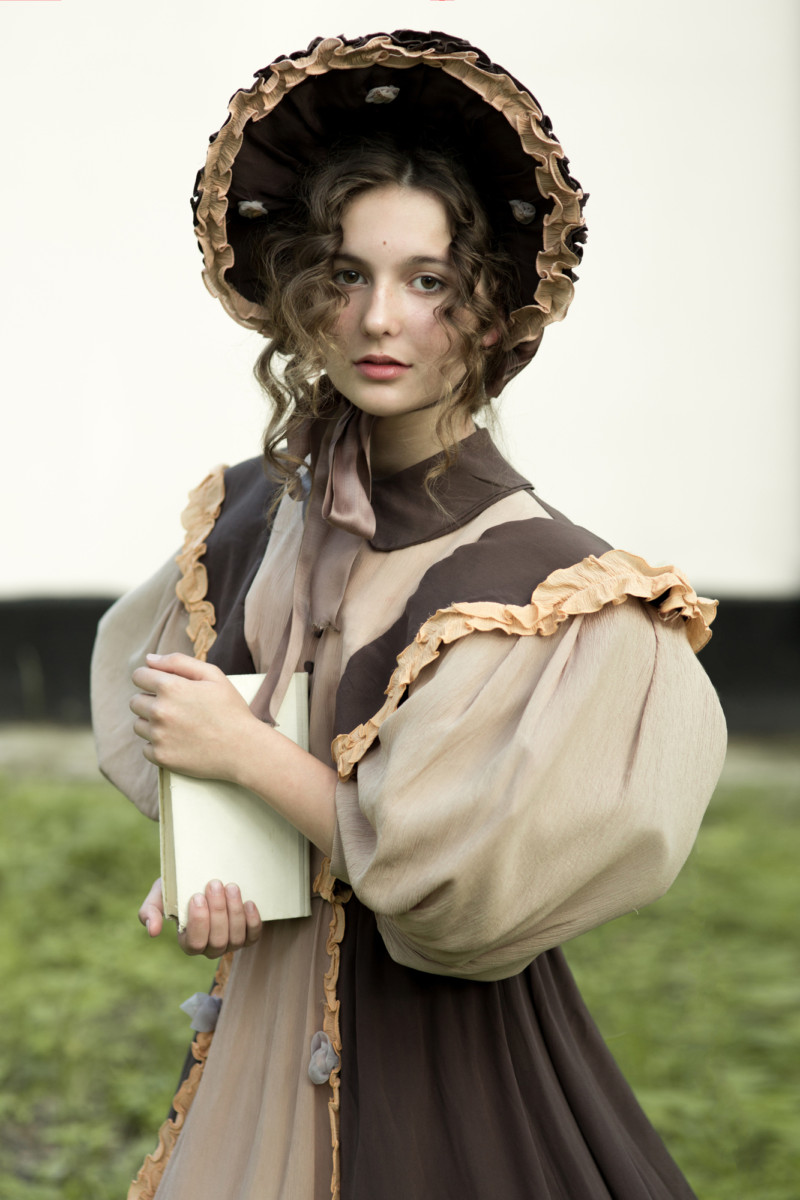
The unhelpfully captioned “A young girl in a hat stands against the background of the forest” by Darya Komarova. This woman is really too young for Tessa; I’d guess she’s in her mid-teens. I wish there wasn’t so much hair in her face, but at least it’s the right color. Her dress is on the ugly side, but her silhouette is unmistakably 19th century even at a small size. Those poofy “leg-of-mutton” sleeves are distinctively 1830s, and Tessa and Joseph meet in 1835 (when she is 19). The way she’s holding that book allowed my designer to have her holding onto Joseph’s arm instead:
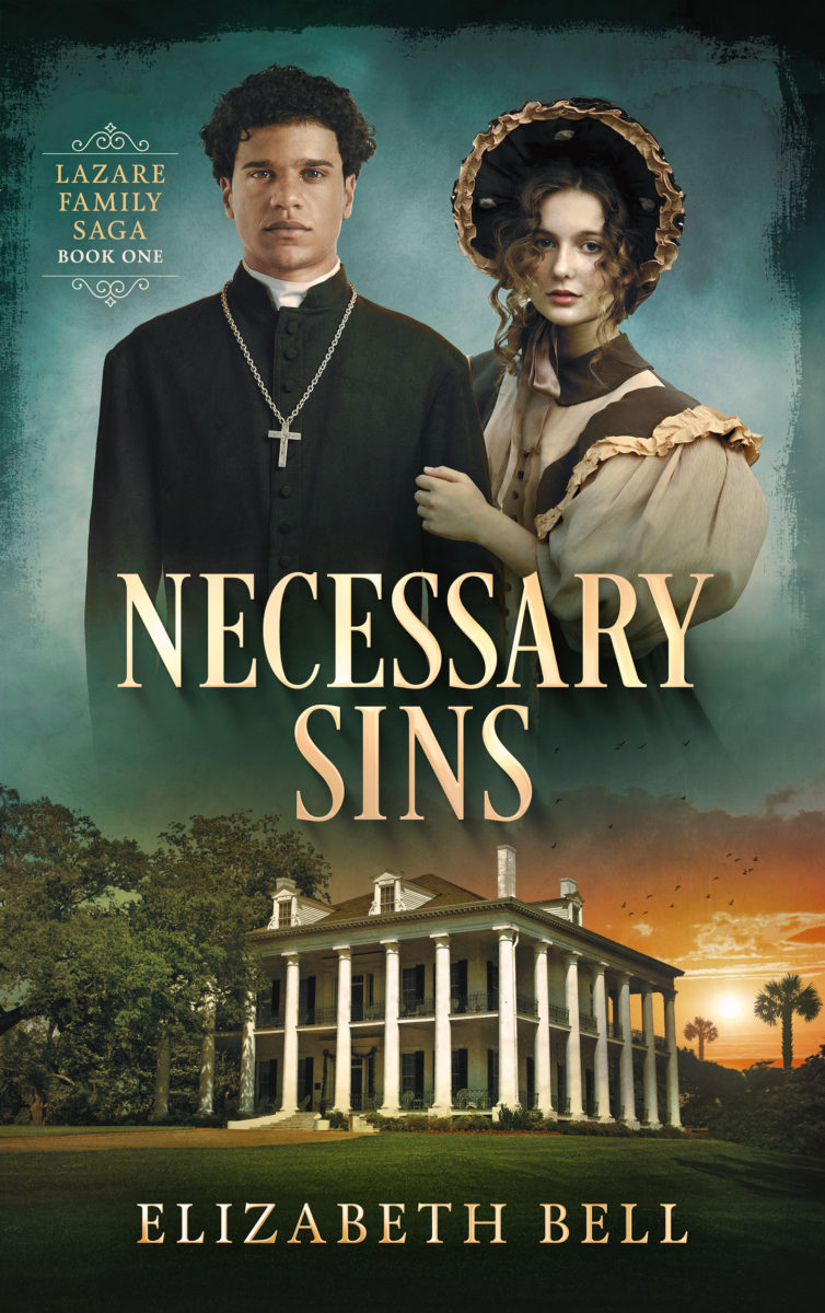
The final cover, thanks to the magic/talent of the designers at Damonza. The sunset with flying birds was their idea. I think it evokes the cover of Sue Monk Kidd’s The Invention of Wings, also set in antebellum (pre-Civil War) Charleston. I asked Damonza to add the palmettos, the state tree of South Carolina with a memorable place in Charleston history.
If you’re thinking “That’s not a Charleston house,” you’re right. This is Dunleith in Natchez, Mississippi. Mansions with columns all the way around the outside are typical of Natchez and Louisiana. When I was experimenting with my own cover mockups, I tried some actual Charleston homes available on stock sites, but none of them said “antebellum American South” at a small size and at a glance the way this one does.
In Necessary Sins, Tessa marries into the Stratford family, who do own a home like this with columns all the way around the outside. I gave the Stratfords a Louisana connection so they’d be inspired to remodel their South Carolina home in this style. With its wraparound verandas, its spaces that are both outside and inside, public and private, this architectural style fits perfectly with the duality at the heart of my family saga. The Lazares themselves are simultaneously Black and White, happy and miserable, pure and wicked…
Fun fact: Once upon a time (two decades ago), I slept in a four-poster bed inside this very house, Dunleith. Built in 1855, it became a National Historic Landmark in 1974 and a bed and breakfast in 1976. I was in historical heaven that night. Thanks, Mom and Dad!
Another bit of fun: Before I had my designer combine images, I tested my concepts by creating mockups in a program called Canva. I needed to make sure the man and woman were about the same size, so I duplicated his head and brought it closer to hers for comparison. I was sleepless and stressed out at this point and a little bit bonkers, so I thought it would be funny to put his head in her bonnet. The result gave me some sorely needed laughs. Designing covers is long hours of hard work, especially when you’re doing it for the second time around. This bit of silliness helped. Did I make you laugh too?
On the cover of Sweet Medicine, Joseph’s nephew Dr. David Lazare is also comprised of three stock images. I asked my designer to add a medical bag to fit the title and his profession. I also wanted David to be wearing his signature Vandyck beard. The original model was clean-shaven, and here’s proof!
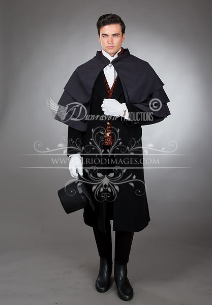
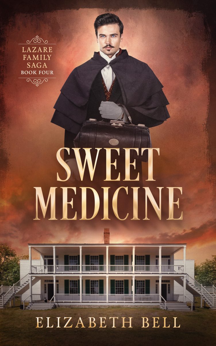
Yep, David’s facial hair is transplanted, likely from this model whom I sent my designer as a reference. David’s beard is probably my favorite bit of Photoshop wizardry on my covers. Victorian men took pride in their facial hair—unless they were priests or American Indians. 😉 This Vandyck really makes David look like David.
As for the building on the cover, that’s another story. My designer and I went through several ideas for the setting image. My characters take a cross-country journey in Sweet Medicine, so my first thought was a train or a stagecoach. But a train isn’t specific to the United States, and there aren’t any good stagecoach images on Shutterstock or Depositphotos. Furthermore, a method of transportation made David’s medical bag look like a suitcase by association.
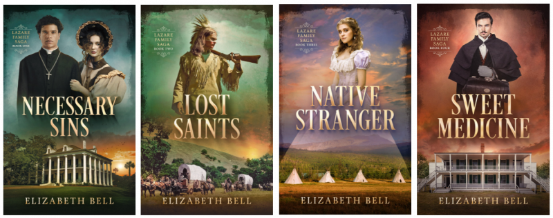
I also considered pretty mountains, perhaps a mountain lake. Again, not technically specific to the United States. As I stared at the four new covers of The Lazare Family Saga lined up together, mountains didn’t quite fit. They didn’t say “American history” in and of themselves the way the setting images on the first three covers do. In their lower images, Necessary Sins, Lost Saints, and Native Stranger all feature predominantly white man-made structures that say “19th-century United States” at a glance and at a small size. I decided we needed another white building to echo the one on Necessary Sins.
What’s special about the structure I chose for Sweet Medicine is that it’s actually doing double duty. The novel begins in South Carolina, and this building looks like it belongs there. In fact, this Greek Revival structure is the oldest Wyoming building still standing—the officers’ quarters at Fort Laramie, constructed in 1849-1850 and nicknamed “Old Bedlam” after its raucous parties. The architect was a New Hampshire man, Lieutenant Daniel Phineas Woodbury, and the blocky wings were part of his original design. They contain kitchens, storerooms, and cooks’ quarters.
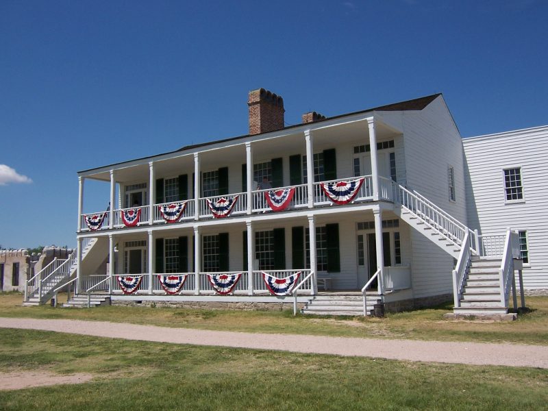
Although my point-of-view characters don’t know the name Old Bedlam, the building makes an appearance in both Lost Saints and Sweet Medicine when they visit Fort Laramie. This military post was an important stop along the overland trail, within sight of the Rocky Mountains. I like the way Old Bedlam evokes both of my saga’s major settings, the Old South and the Old West.
Old Bedlam also gave me an opportunity to include an “Easter egg” on the cover of Sweet Medicine, a “Waldo” hidden in plain sight.
These ebook covers’ primary purpose is to shout “I’m historical fiction!” at a small size. But I couldn’t resist asking my designer to add a second character besides David, a character discernible only if you view
Sweet Medicine at a large size. Even then, the second character will be tiny. Can you find him?
Click on the cover for the file, where you can zoom in.
Here are a few hints: This character’s name is Allister, and he also represents his distant cousins Mignon and Reinette. He belongs to E. P. Vaux, but Allister has been visiting one of Old Bedlam’s kitchens in hopes of a treat.
Or click here to cheat and see a closeup view of the character. 😉

I hope peeking behind the scenes of my cover redesign has been a treat for you, dear reader. I’d love to hear what you think!


I love knowing the process of picking book covers. I recognized the Fort Laramie building immediately. We visited in 2018 on our way back from Alaska.
I am about to start the 4th book in the series and I know I will feel a loss when I finish. I want their stories to continue and know they can’t.
This is the first time I have read in depth the rituals of the Catholic priesthood and found it fascinating. Thank you for writing such a wonderful series.
Thank YOU so much for your comment, Carol! Your words warm my heart, even if it took me a few weeks to see them! Fort Laramie is truly a special place, and I’m glad you got to see it for yourself. Some readers thought there were too many Catholic rituals, so I’m glad you found them as fascinating as I did. I like to think that in some parallel universe, my characters are real, and there, their stories DO continue beyond what I’ve recorded. 🙂