What’s That Symbol?
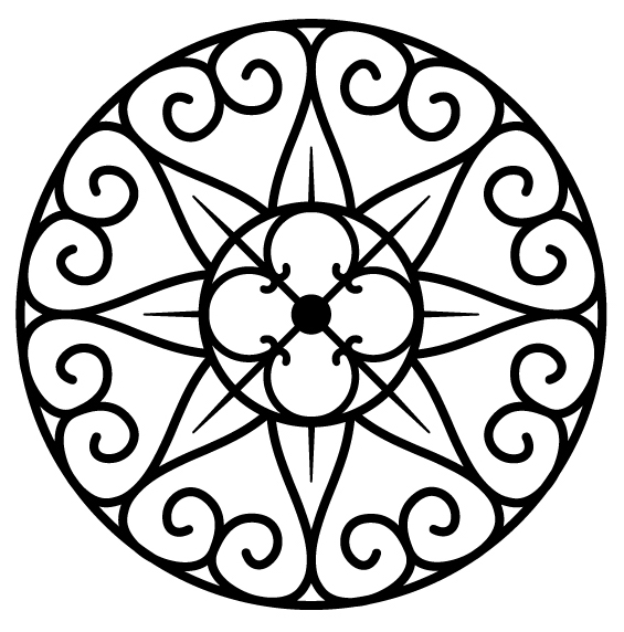
You may have wondered about the ornate, round design I use as an avatar. It’s a logo I created to symbolize my historical fiction series, the Lazare Family Saga.

I was able to pack a great number of meanings into this design, significance both complementary and conflicting. Paradoxes are at the heart of my work; rather than either/or, I choose and. To quote Walt Whitman’s “Song of Myself” (1892):
Do I contradict myself?
Very well then I contradict myself,
(I am large, I contain multitudes.)
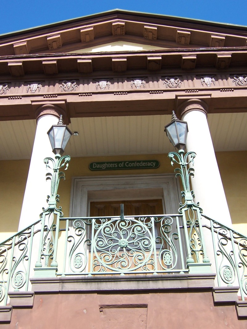
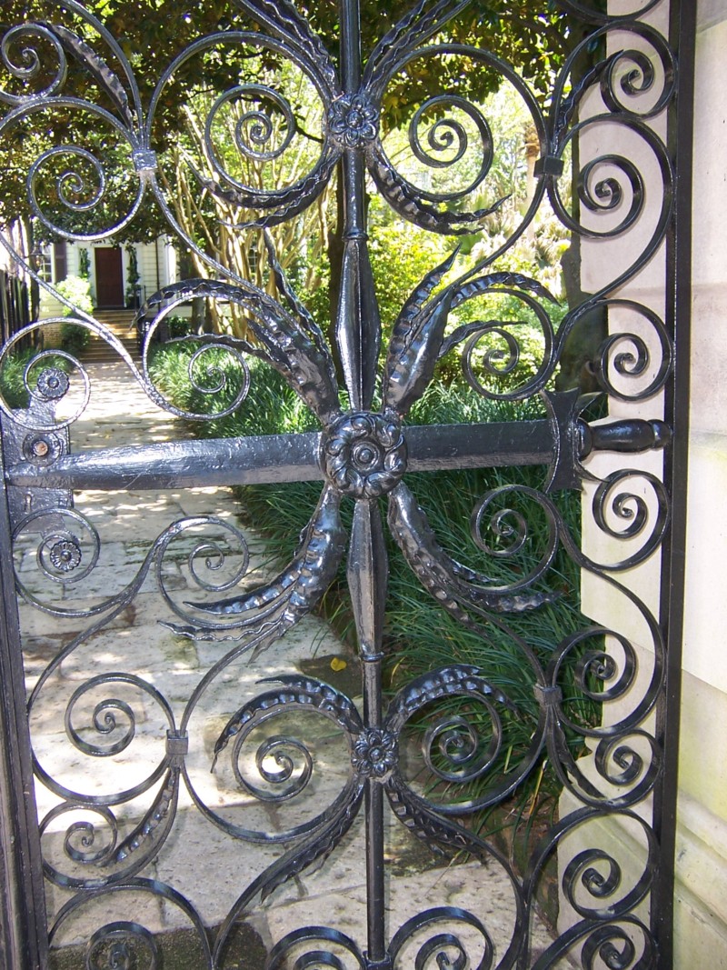
The shape was originally inspired by the historic wrought iron of Charleston, South Carolina, the setting for much of my saga. Here are just three examples of Charleston ironwork, limited to circular designs, my own photos from a research trip in April 2018.
With the help of a designer on Fiverr (a lengthy, frustrating, but ultimately successful endeavor) I created my own pattern by combining elements from two particular wrought iron gates in Charleston.
One gate stands on the campus of the College of Charleston at the 1846 Knox-Lesesne House (14 Green Way). I love this gate so much, I bought a necklace based on the pattern from Charleston Gates on Etsy.
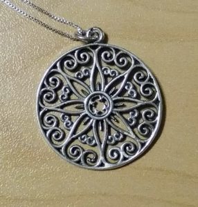
I wore this necklace while I wrote much of the Lazare Family Saga’s penultimate draft. During my 2018 research trip, I was able to view the Knox-Lesesne gate in person, but it was obscured by a poster.
The other Charleston gate that inspired me is located at a private home on the Battery (the area near the sea wall). I first discovered this gate on Pinterest. Here’s a beautiful shot of it on Alamy Stock Photo. When I visited, it was obscured by a sign but enhanced by a friendly canine.
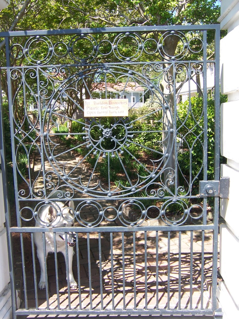
Within their circular designs, these two gates contain “hearts and flowers,” symbolizing both the romance and the gardens in my work. But there’s a lot of additional symbolism to unpack.
The four-petalled central flower represents Charleston’s rich botanic history and the fact that two of my central characters, Joseph and Tessa, are gardeners. Throughout my saga, but especially with these two characters, I use the Victorian Language of Flowers (a subject for another post).
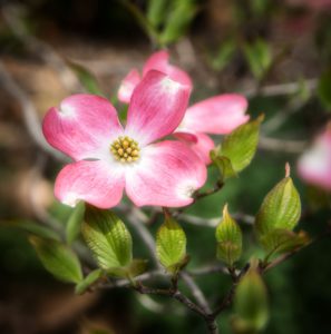
Those could be the four showy bracts of a dogwood, a Southern favorite with special significance for Tessa. You’ll have to read Necessary Sins to find out why. 😉
The central shape could also be a four-leaf clover, evoking Tessa’s Irish homeland.
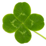
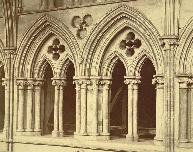
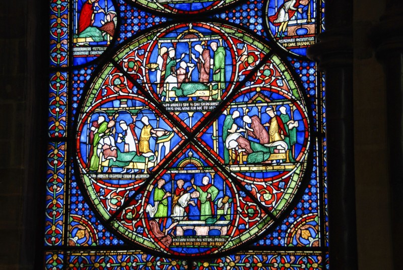
The shape at the center is a quatrefoil too. That’s a Latin word meaning “four leaves.” Quatrefoils were often used in Gothic cathedrals because they symbolize the Four Gospels. Thus the shape evokes my characters’ Catholic faith and Joseph’s priesthood.
Yet my logo also signifies Native spirituality and the Western parts of the Lazare Family Saga. To the Zizistas (Cheyenne Indians), the number four is holy because it represents the four directions and the Sacred Powers who reside there.
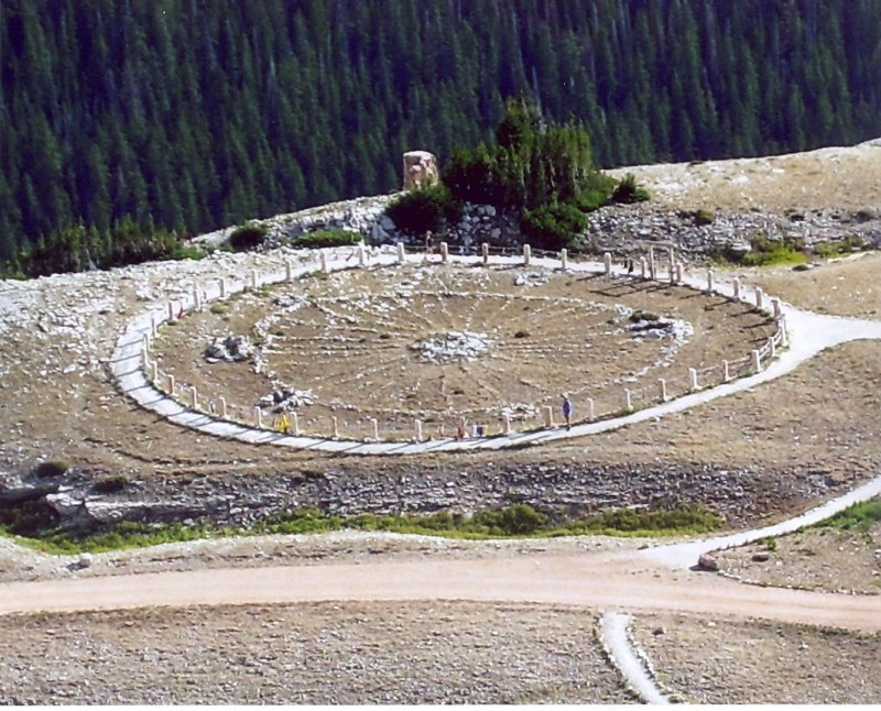
A circle divided into four quarters recalls a medicine wheel, a native symbol of rebirth. The four parts are the four phases of a person’s life and his growth in wisdom. My character Ésh has a quilled medicine wheel on the medicine pouch he wears around his neck. In Book 4 of my series, Sweet Medicine, I mention a giant medicine wheel made of stones on the High Plains. Such medicine wheels still exist, and they are sacred places to Native peoples.
Many ancient cultures consider circles holy because they have no beginning and no end. Likewise, my logo reflects and repeats itself. Rebirth is a motif in my saga; it’s why I named the central family the Lazares, after the Biblical figure of Lazarus.
Around the outside of my logo, the heart shapes signify the importance of love in my work. But the shapes also resemble sankofas.
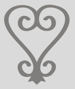
A sankofa is a symbol from the Akan tribe in what is Ghana today. This region of Africa is the homeland of many people fated to become American slaves, including a character introduced in Book 3 of my saga, Native Stranger. He’s an enslaved blacksmith named Shadrach, and he makes a sankofa pendant for his beloved.
Literally, sankofa translates to “Go back and fetch it.” The symbol is about going back in order to go forward. To Shadrach, a sankofa means “Learn from the past so you can change the future”—even when that past is painful. To me, a sankofa also represents historical fiction, the importance of remembering and making the past come alive in the present.
Between the hearts in my logo, the triangular shapes are veined leaves radiating from the central flower.

But if you consider those “veins” in the three dimensions of wrought iron, they would be spikes, evoking chevaux-de-frise. These were a nasty defense mechanism installed around some 19th-century Charleston homes to defend from invaders, especially rebelling slaves. Chevaux-de-frise survive on the fence of the Miles Brewton House on King Street.
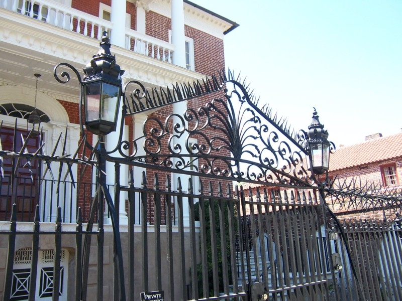
These spikes counterbalance the potentially gooey “hearts and flowers” elements in my logo. They say “There is romance here, but there is also danger—even suffering.”
Or are the spikes just leaf veins after all? Don’t get to close, or you might find out… Is this the forbidden Tree of Knowledge, or the sacred Tree of Life?
I would argue that love is both Knowledge and Life, both Death and Rebirth. Remember I said my work is about contradictions?
Speaking of forbidden fruit and rebirth, the ouroboros is another circular symbol featured in my books: a snake eats its own tail and thus sustains itself for all eternity, creating an infinite loop. Likewise, the events in my saga are often cyclical, echoing from one generation to the next. For the Lazare family, is the loop fulfilling or destructive? Or both?

Speaking of double-edged swords, my amazing editor, Jessica Cale, saw something in my logo I didn’t: four swords. The sword points are the “leaf veins” or iron spikes that begin between the lobes of the quatrefoil. The sword handles are ornaments I borrowed from the Battery gate (the one with the dog). I thought these ornaments simply gave the design flair and helped to suggest wrought iron.

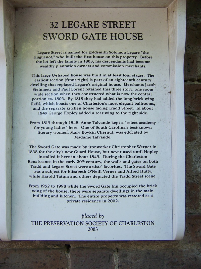
In Book 2 of my series, two characters do pretend to “cross swords,” though they’re actually tree branches. Later, the Battle of Turkey Creek (a.k.a. Solomon’s Fork) between the Cheyenne and the U.S. Army is decided when the white soldiers draw their sabers. And there is a Sword Gate House in Charleston, named after its famous ironwork.
This home was once an elite girls’ school run by Madame Talvande, a Saint-Domingue émigrée who is a minor character in Necessary Sins, Book 1 of my series. So my subconscious put those swords there. 😉 Another happy accident: my logo also suggests a compass rose, symbolizing my characters’ travels.
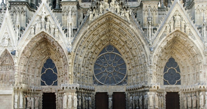
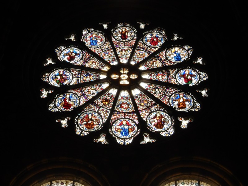
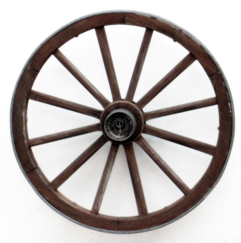
As a whole, my logo reminds me of two things: a rose window and a wagon wheel. A rose window neatly brings together both Catholic symbolism and floral symbolism.
The wagon wheel recalls the emigrants on the Oregon Trail, the settling of the American West by Euro-Americans and the destruction of the Native Americans’ way of life (another double-edged sword). My designer and I are currently working on the back cover of Lost Saints, Book 2 in my series, which will feature a wagon wheel. It could also be a stagecoach or train wheel, methods of transportation my characters use in later books.
One of my favorite pieces of historical fiction, the 2005 TNT miniseries Into the West, follows a white family and a Lakota family throughout the turbulent decades of the 19th century. The writers use both the wagon wheel and the medicine wheel to symbolize these cultures’ values and the conflict between them. The white family is even named Wheeler.
So those are most of the meanings packed into my logo. The symbol is also a claire-voie. What’s a claire-voie? Follow this link to my next blog post!

